Background
During my SheDesigns UX Course I worked on a group project with three other students where we analyzed the issues with the Southwest Site and chose one area of the site to improved. We worked through the design process and created high-level designs for a prototype
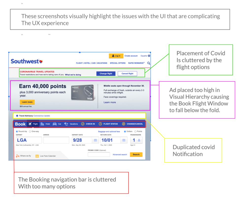
Initial UX Challenges: Southwest’s website is cluttered and out of date. The home page has too many ads and links. Many of the links and user flow paths are repeats. This results in the users being overwhelmed and confused by choices. The large amount of ads put the book flight form below the fold. The sites core functionality is buried and hard to find

Information Architecture
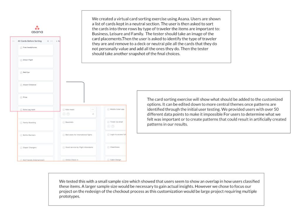
We categorized the data on the existing site and app. This helped us better understand how the data was being presented to Users and how they were interacting with it. In addition to the checkout process data we determined that there were 4 different data classifications: Incentives-Package deals and who they targeted, information specific to different types of travelers (business, family, ect.), safety- updates about covid and weather, flight delays and changes, and Status of existing trip-Updating trips, changing flights.
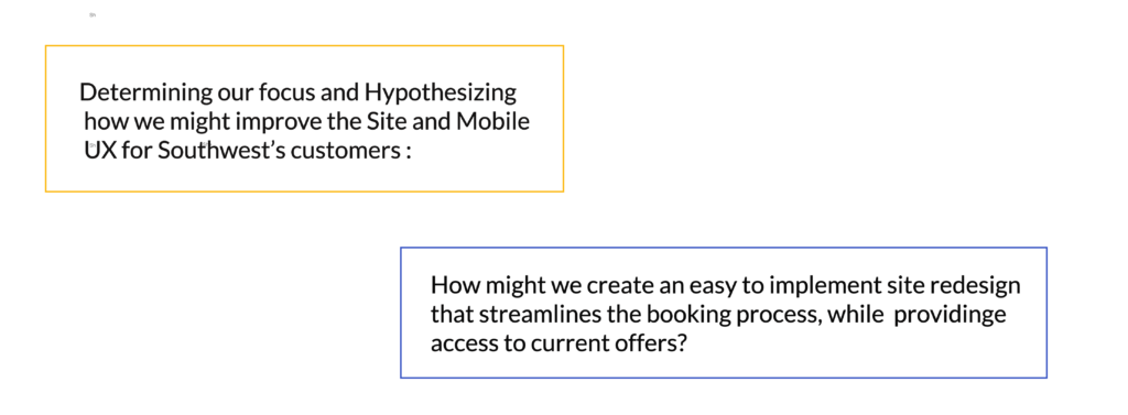
Given that we were redesigning an existing product feature we did not need to redefine user profiles. Instead we focused on analyzing the websites And mobile apps of competitors. This helped us define functional design for this market. Based on the Information Architecture and our competitive analysis we were able to determine that all user profiles could be categorized into two groups: new and existing customers. We hypothesized that the solution to Southwest’s clutter UI was to simplify the homepage to focus on the user function: booking flights and making other travel purchases.
User Flows
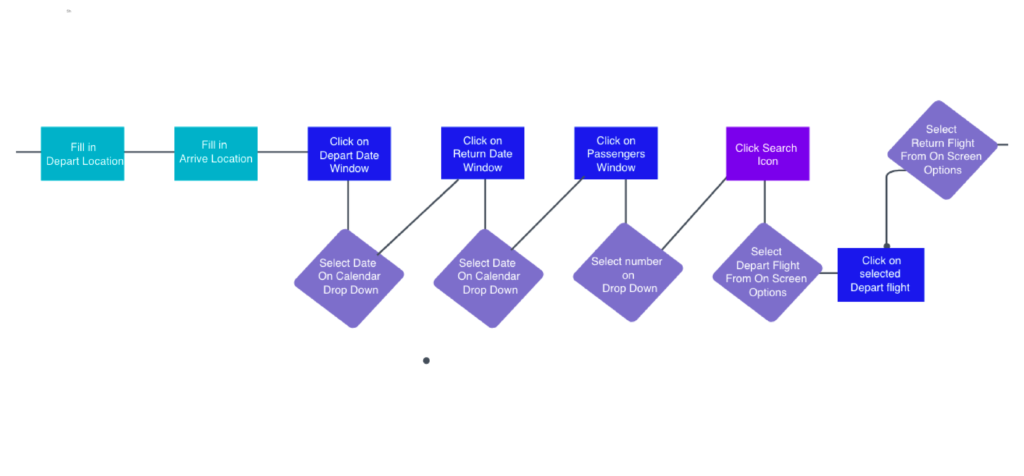
For the purpose of prototyping we decided to focus on creating. the simplified homepage. We analyzed the original user flow.

Our Changes to the User Flow
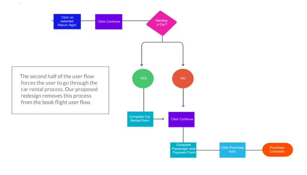
For the purpose of prototyping we decided to focus on creating the simplified homepage. We analyzed the original user flow.

The car rental portion of the original user flow has been removed to simply the “Book Flight User Flow”. In the original design the “Car Rental User Flow” is a separate option and embedded in all the purchase user flow options that can be selected. This is why it makes sense to remove it from the flow of the “Book Flight” landing page as well as the other initial landing pages.
Issues with the Original Desktop design
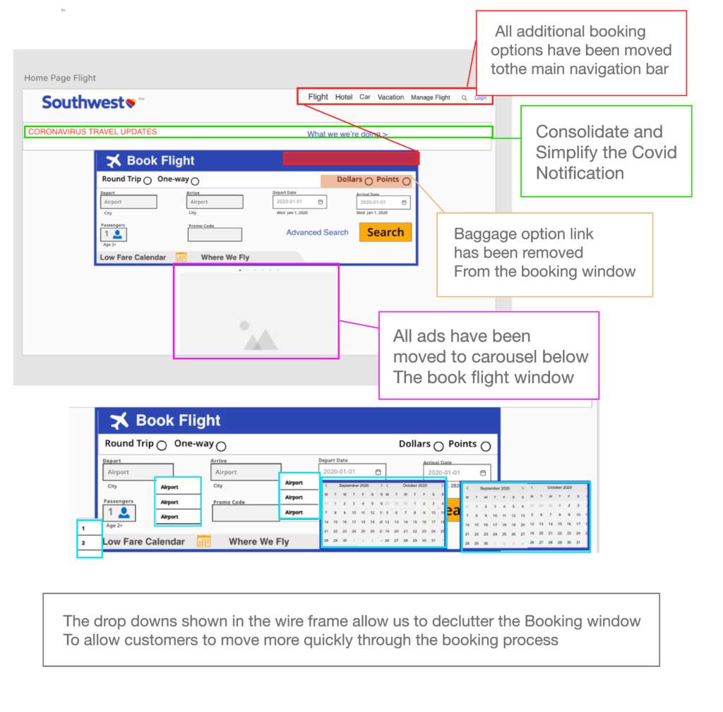
Book Flight WireFrame
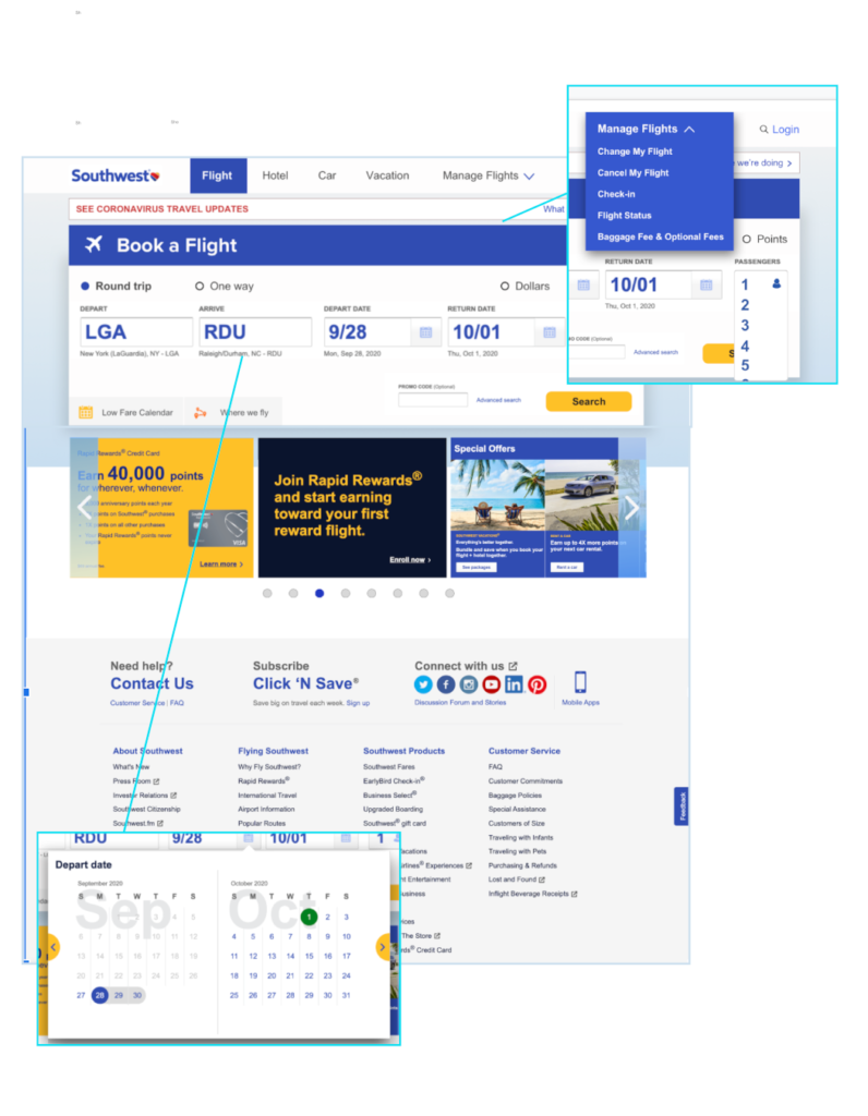
Book Flight High Resolution Mock Up
The result is a sleek minimalist UI where the focal point is the core site functionality. users are still able to access all the information that was presented in the original site. However they are no longer bombarded with it all at once new users can make purchases quickly and efficiently before they lose interest. This home page is to be repeated for Hotel, Car Rental and vacation packages.
The additional pages are to be accessed via the navigation on the top navigation bar. An additional example is shown for the Hotel purchase home page.
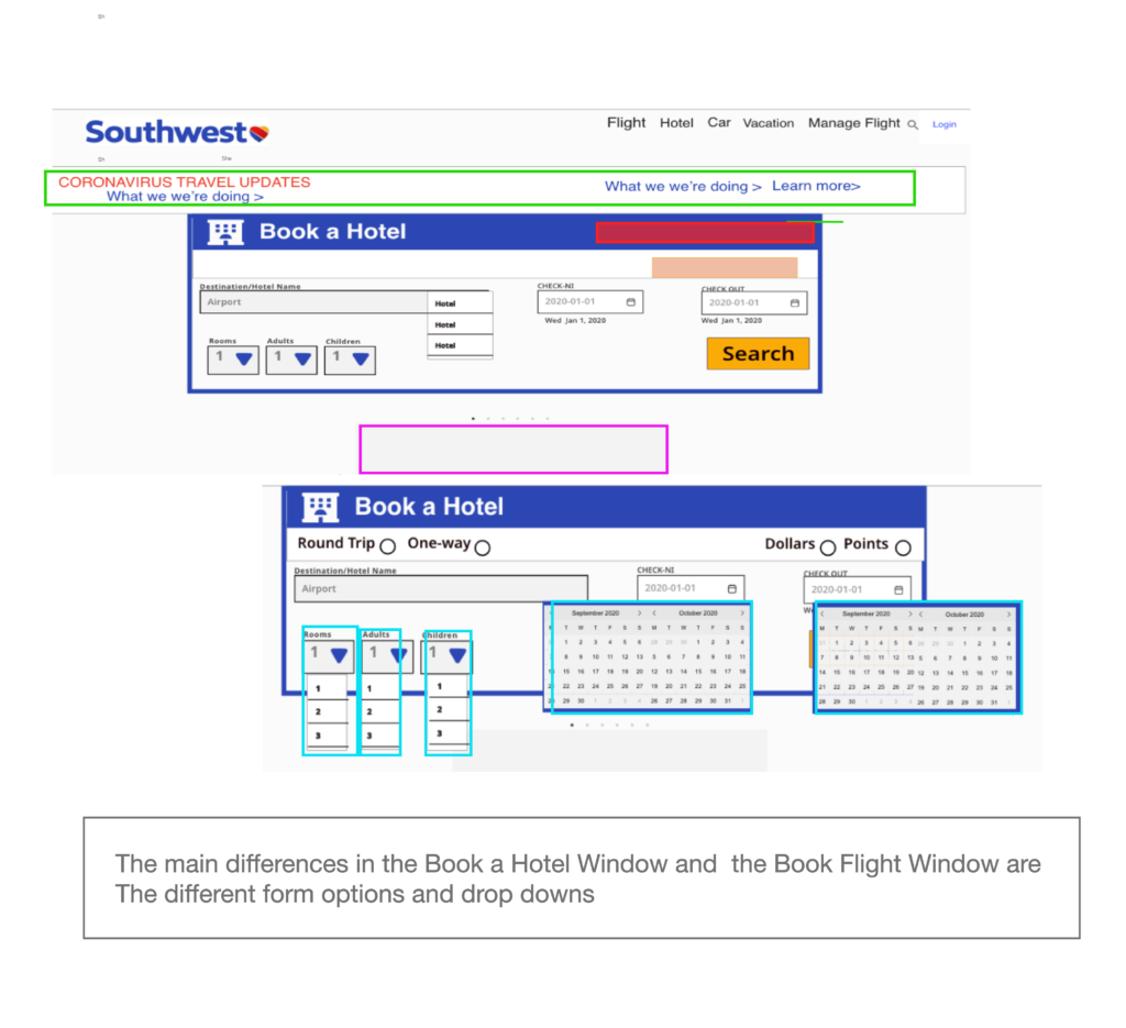
Book Hotel Wireframe
Our redesign was built around a standardized framework for all booking processes. while each user flow has been given its own landing pages, the standardization of the booking windows means that minimal developer resources will be needed for the proposed revamp of this feature.
Book Hotel High Resolution Mock Up
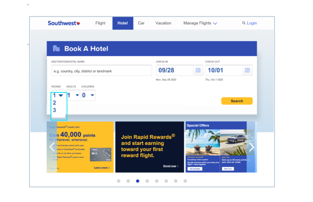
As you can see this creates a focused user flow that drives new users to purchase without overwhelming them with the economy of choice.We focused on providing the core services while providing the best experience.
Revamping the Mobile Booking Experience
Arguably improving the mobile booking process is equally if not more important. As consumers increasingly make purchases using mobile devices. Our research process revealed that that Southwest’s app is plagued with many of the same UX issues as their desktop site.
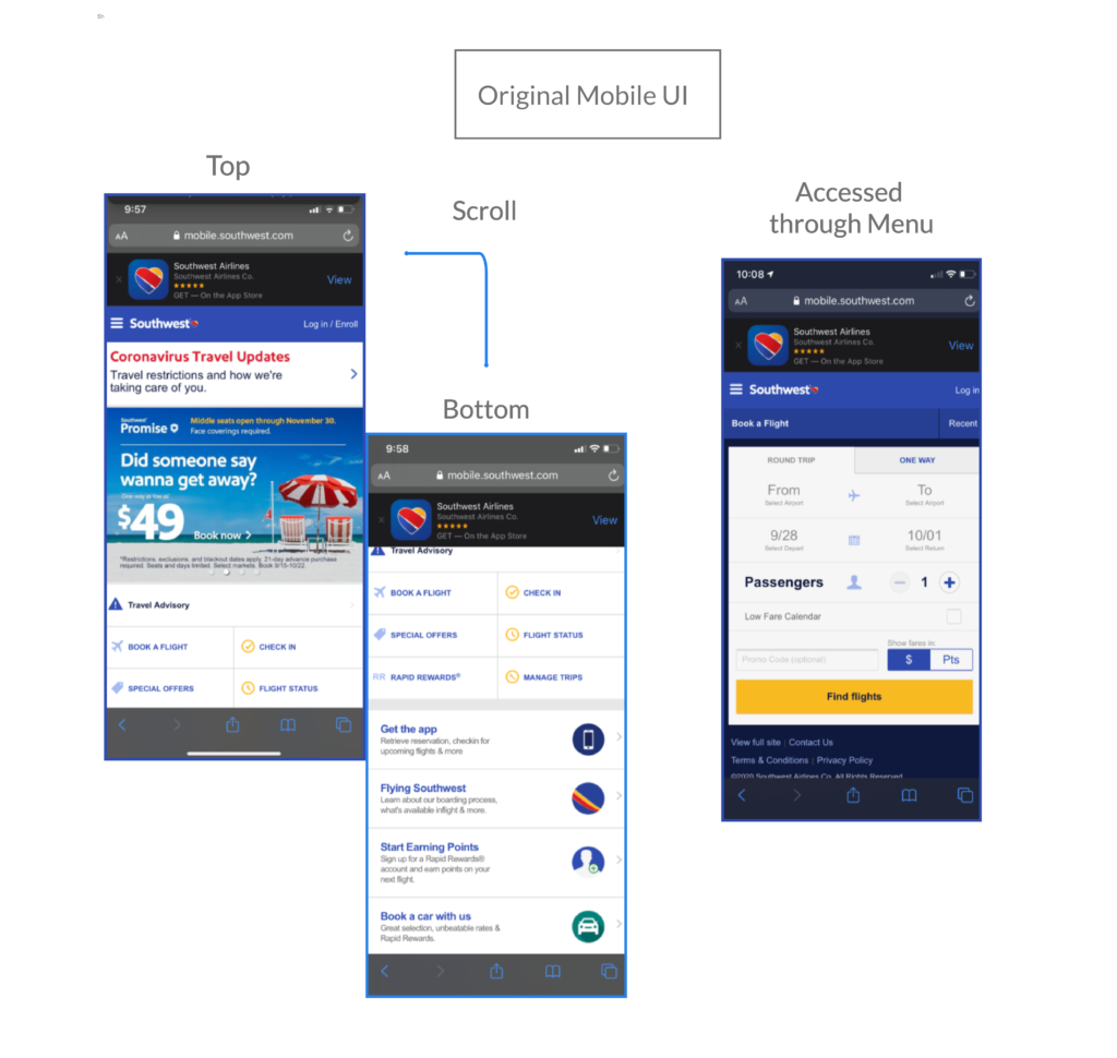
The mobile interface has current offers/ ads as the focal point of the opening page. However the design is not consistent with desktop because the booking process is only accessible to the hamburger menu. The result is that the booking process is even less accessible for new users.
Mobile Flight Booking High Resolution Mockup
We adapted the infrastructure developed in the desktop wireframe to create a mobile booking process with a fuser low consistent with the desktop design. Threads are placed below the adapted flight booking window. The elements have been placed vertically to fit mobile screens.
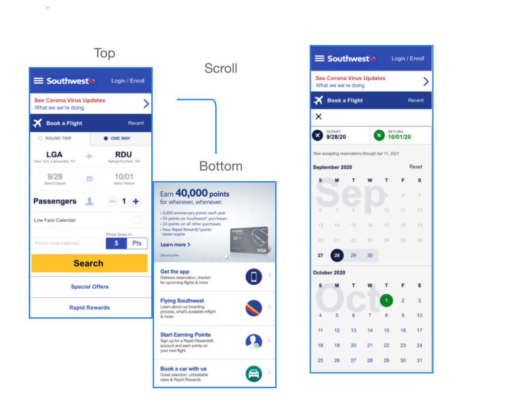
The calendar opens in a drop down in from of the Booking Window. The same calendar format is used for the other booking menus which are accessed through the hamburger mobile navigation menu.
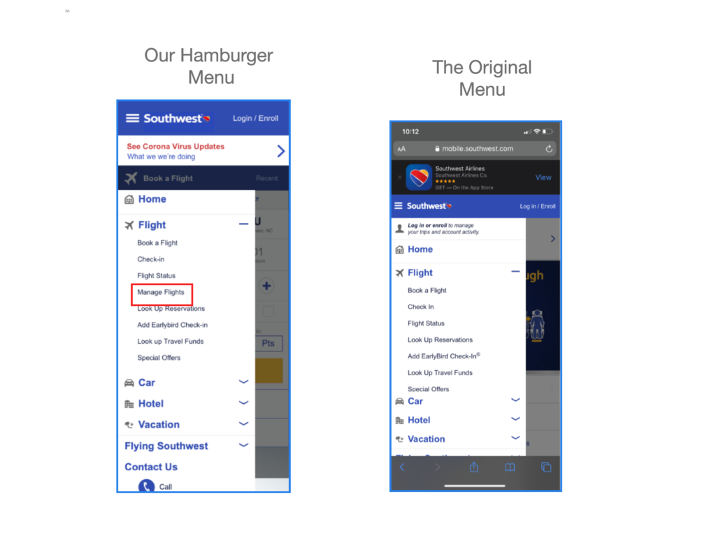
Mobile Navigation through a Hamburger Menu
We determined the original design of the hamburger menu to be functional. We were able to keep the design and add a manage flights option to make the menu fully consistent with the desktop navigation design.
Mobile Flight Booking High Resolution Mockup
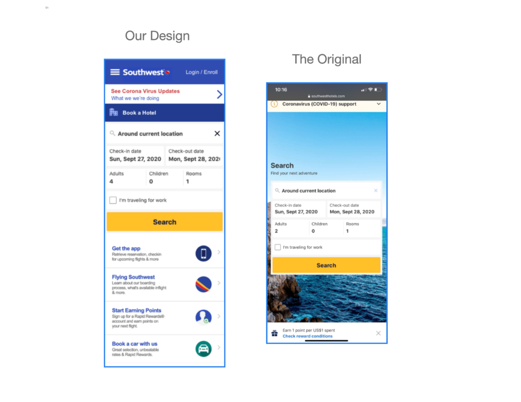
We also adapted our Book a Hotel desktop design for mobile. The hotel booking mobile UI, did not have ads but is rather cluttered with a large image. It is completely inconsistent with the desktop user experiences and the other mobile booking interfaces. We removed the background image allowing for a more focused booking process.
What I learned?
Working in a team project allowed me to learn where my strengths are and where I can best contribute to the process. Overall redesigning a portion of the Southwest site helped us see how important building a strong user flow is to creating functional design.